Unlocking Organizational Insights Through Data Visualization
In today’s high-stakes business environment, where organizations must juggle dozens of initiatives simultaneously, clarity isn’t just an asset—it’s a necessity. For CxOs and VP Delivery professionals, harnessing the power of data visualization has become the cornerstone of effective portfolio management
Praful Pujar
11/19/20242 min read


Why Data Visualization Matters
Data is often likened to oil, a raw resource with immense potential. However, without refining and processing, it remains dormant. Similarly, data alone isn’t enough—it’s the ability to interpret and present it meaningfully that unlocks its true potential. For leaders managing a portfolio of projects, this means leveraging data visualization tools to illuminate patterns, anticipate risks, and optimize resources.
Imagine having an implementation management platform that consolidates disparate data points into a unified dashboard. Such a tool doesn’t just display numbers; it tells a story—about progress, challenges, risks, and opportunities across the portfolio lifecycle.
Gaining Holistic and Granular Insights
The strength of a robust data visualization platform lies in its versatility. Leaders need both the forest and the trees—a high-level view to grasp overarching trends and a detailed perspective to drill down into specifics.
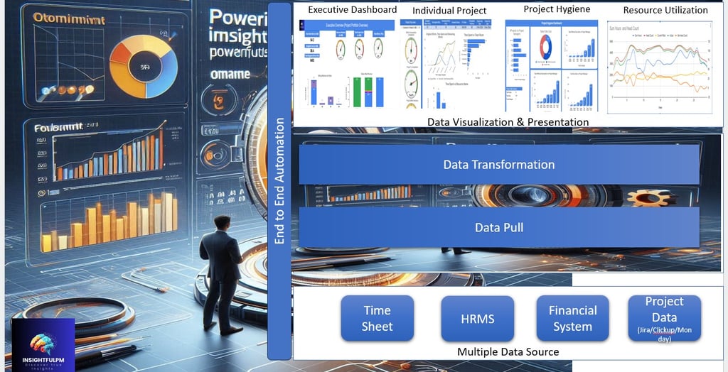
Executive Dashboard: A snapshot of key performance indicators (KPIs) designed for strategic decision-making. With visual summaries, such as trend lines and pie charts, executives can gauge project health at a glance, enabling faster, more confident decisions. By empowering leaders to monitor KPIs effortlessly, the Executive Dashboard frees up time for strategic decision-making, fostering alignment with business objectives.
Individual Project Views: These dive into granular details, such as task completion rates, resource utilization, and potential bottlenecks. Interactive timelines and task status dashboards empower project managers to ensure projects stay on track.
Proactive Risk Management Through Visual Cues: One of the standout features of effective data visualization is its ability to surface risks before they escalate. Consider a Project Hygiene module, which uses color-coded risk matrices and Gantt charts to highlight overdue tasks, resource constraints, and scope creep. With intuitive risk matrices and predictive insights, leaders can act pre-emptively, ensuring potential issues are resolved before they affect timelines or budgets.
Optimizing Resources Through Visual Heatmaps: Resources—humans, are the backbone of any project. A Resource Utilization module leverages heatmaps and bar charts to provide visibility into workload distribution. Leaders can identify overburdened teams, reallocate tasks, and align efforts with strategic objectives. This not only optimizes productivity but also fosters team morale by preventing burnout.
Financial Insights at a Glance: No portfolio management discussion is complete without considering the financial dimension. A Financial System integration visualizes project costs, profitability, and burn rates using real-time graphs and dashboards. This enables leaders to make data-driven decisions about where to invest and where to cut back, ensuring financial health without compromising on outcomes.
From Raw Data to Strategic Action
What sets this approach apart is its ability to transform raw, unstructured data into actionable insights. By examining the same data from different perspectives and consolidating it with diverse streams, organizations can uncover entirely new dimensions of understanding. This holistic view enables leaders to visualize organizational health in ways previously unseen, empowering them to transition from reactive management to proactive, strategic leadership.
For example, a cost-performance index (CPI) dashboard might reveal that actual costs are consistently exceeding budgeted amounts for specific projects. Armed with this insight, leaders can investigate root causes—be it scope mismanagement, resource inefficiencies, or unforeseen dependencies—and take corrective action.
The Road Ahead: A Data-Driven Future
As the digital revolution accelerates, the ability to leverage data visualization will differentiate high-performing organizations from their peers. Solutions that combine data aggregation, visualization, and actionable insights driven through AI represent the future of portfolio management.
By adopting such tools, organizations can not only navigate the complexities of varied projects, but also drive measurable results that align with long-term organizational goals.
Don’t let complexity limit your organization’s potential. Explore the advanced tools at https://insightfulpm.com/Dashboard and discover how data visualization can revolutionize your approach to portfolio management.
